Week 5: Personas

Week 5: Personas

Image result for blank user persona

Image retrieved from https://xtensio.com/wp-content/uploads/2016/02/Xtensio_Tool_UserPersona2V2-min.png


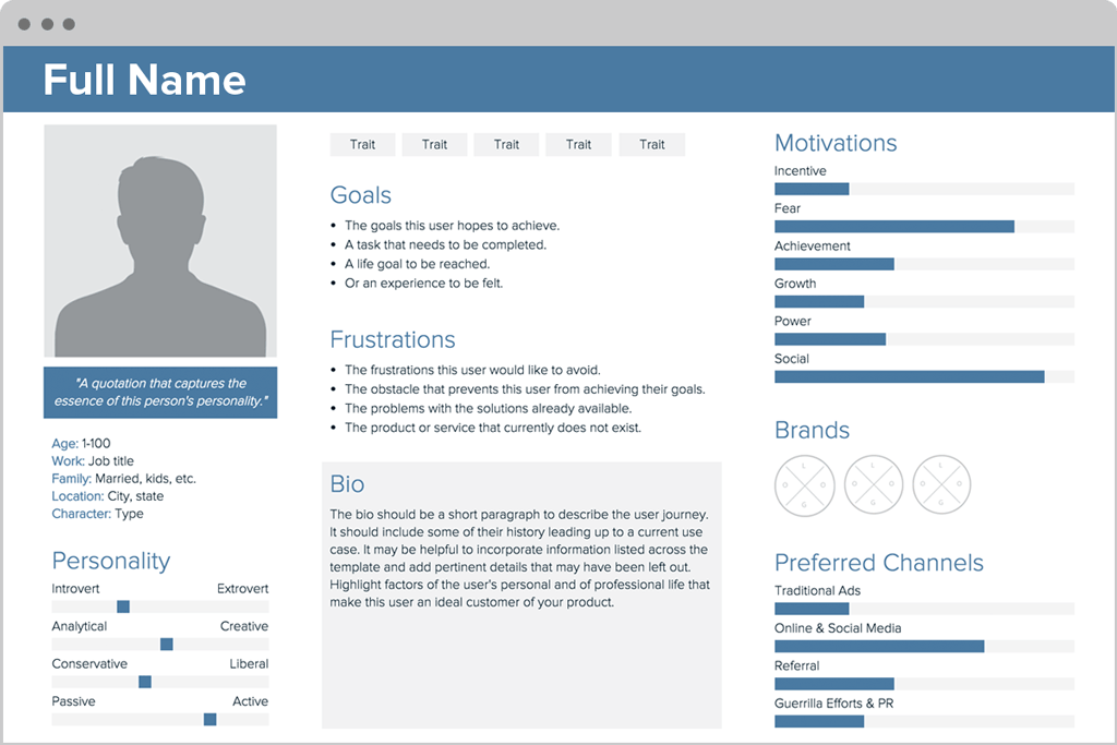
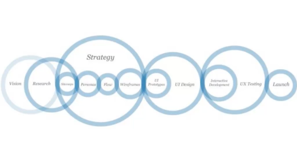
User Personas: How you set up a persona:

  • Age
  • Sex
  • Occupation
  • Hobbies
  • Likes/dislikes
  • Other details germane to the product such as: behaviour patterns, goals, skills, attitudes, their environment (or context)
  • Large vs. small audience
  • EBay site; larger audience
  • Dora the Explorer website; smaller audience
  • What
  • Netflix across platforms; iPad, iPhone, computer.
  • How
  • Users who want to browse vs. users who want specific content
  • Mental Models
  • Mental models are what thoughts people form around an idea, or activity, and these vary from person to person. E.g. A 16-year-old mental model of taking a note may include using a smartphone app, which is very different to an elderly person’s mental model of using a post-it note.
  • Mental models are incredibly important user experience, because they illustrate how your user approaches a particular problem.
  • Artefact Personas
  • Another approach is to apply the personas to the artefact; the project of product, not the user. This can be most useful for client meetings, where often the discussion collapses into subjective assertions like: “I don’t like green”. By having a developed and great personality for your project will give everyone a context to objectively evaluate the visual design and lets you get the discussion back on track if it veers off into subjectively or personal likes and/or dislikes, it takes it away from the visual design.
  • Product Personality Questions:
  • If the interface were a person, what would she or he be like?
  • How would you expect uses to react when they first view the product?
  • How would you describe this product to a friend?
  • How is the product different from competitive products?
  • Which celebrity (or car, movie etc.) is the product like?
  • Why?
  • E.g. A medical device to help elderly patients manage their healthcare in their homes:
  • For this, it was learnt by stakeholders that the elderly were more likely to accept the product if it had a similar personality to that of a visiting nurse. This knowledge helped them shape a visual appearance that presented itself as caring, conscientious and trustworthy in tone and style.
  • The first step they did was develop experience key words, and during this process they listed and grouped any descriptive words or concepts that occurred during stakeholder and user interviews. These groupings formed the foundation for a set of experience key words that would define and govern the visual strategy.


Reflection:
Although one persona is solely the focus of a product, many personas are also implemented. It’s important to develop personas in the beginning of your design process, in order for everything to develop as you like, with the user base fresh in mind.


Precedent Presentation – Pianu.

Precedent Presentation – Pianu.

Screen Shot 2017-03-21 at 10.42.12 pm.pngReceived from https://pianu.com.

What is the Pianu?

Pianu is an online interactive that somewhat informs and teaches the user on how to play the piano. It runs entirely in your computer’s browser, without any software. The site provides different levels of teaching, purely based on the user’s requirements.


Target Audience.

Pianu isn’t solely based towards a particular audience, in fact, due to the sites versatility in terms of difficulty/levels and the use of either your keyboard or a real instrument, it’s really focussed towards any audience with an interest in learning piano. Pianu offers a song directory, which is a list of songs ranging in difficulty from beginner to expert, progressing in difficulty. There’s also a service called Pianu Academy, this is where they offer interactive lessons, and a lesson plan that begins with the basics of the piano all the way up to playing complex pieces, step by step, in order for users to learn at their own pace.


What knowledge did they assume of target audience?

Pianu assumes that the users have at least an extremely basic knowledge of a piano, and how to play. The site accommodates for users of all levels, beginner to expert, if you know how a piano should be played (by pressing the keys), everything should be straight forward from there.


User Interactivity.

Screen Shot 2017-03-21 at 10.36.11 pm.pngRetrieved from https://pianu.com/intro/ode-to-joy.

This site offers an abundance of interactivity, including menus, buttons and sound. The main interaction within the site arises through the tutorials.  The tutorials act like a, in the fact that the keys you should press come down from the top of your screen and when they land on the key, you should press it and hold until the next note comes down. During the tutorials there are also pop-up menu’s located towards the left of the screen, in which are used to toggle and therefore customise the site to suit the user.

Visual Design, Layout, Colour and Typography.

Screen Shot 2017-03-21 at 10.40.50 pm.pngRetrieved from https://pianu.com/academy.

The site’s design is minimalistic, yet engaging. The graphics included in Pianu, are mostly flat design, with the exception of a couple of photographs. The layout is simple and easy to navigate, which is aided by the limited colour palette as well as the easily identifiable graphics.

Improvements.

  • higher contrast between typography and background colour
Week 4: Instructional Design

Week 4: Instructional Design

Instructional design: informing someone on how to do something or to explain how something works.

In our daily life we commonly interact with instructions on many different levels. Whether it be audio instructions from an automated phone system, using a ticket meter, or installing toner in a printer, we depend on well designed instruction to perform these tasks.


Ineffective designs:

  • Too simple designs with no text or context
  • Split – Attention effect – when text instructions are apart from graphics
  • Too much text

screen-shot-2017-03-19-at-5-32-01-pm

Image retrieved from  https://vimeo.com/159655661

Effective designs: 

  • Medical Diagrams on how to do
  • Marry both graphic and text together
  • Straight forward instructions
  • isolate the important elements of the design (try avoid photography)


Kinds of Interaction:

Instruction – user tells program to do something like pushing a button.

Conversation – back and forth dialog.

Manipulation – drag and drop elements.

Exploration – open, game-like, playful.

Reflection:
Instructional design is evident in everyday life.
Efficient designs are easy to follow.

Week 3: Design Patterns

Week 3: Design Patterns

  • screen design basics & design patterns for screen
  • user interaction and page composition – differentiation between mobile, tablet, laptop and desktop screens

“Mobile First”

  • “mobile first” is new buzz word in the screen design sector
  • designing for mobile first is a more effective design approach
  • process begins for smaller screens then adapted to larger screens
  • movement forces you to prioritise information, and to alter mental structure which is accustomed to larger screens

UI Pattern Proliferation

  • many similar UI designs
  • example: WordPress and their theme sites
  • common UI design patterns are easy to navigate and use
  • design patterns have matured and there is also no real reason to reinvent UI patterns and little innovation for UI patterns.

9 popular design patterns/trends:

  • Hamburger Button (menu)
  • On scrolling
  • Account registration
  • Card layouts
  • Hero Images
  • Scrolling and background animation
  • Material design
  • Flat design

Hamburger button

Screen Shot 2017-03-12 at 22.09.00.png
Image retrieved from https://vimeo.com/159663778
Screen Shot 2017-03-12 at 22.12.04.pngImage retrieved from https://vimeo.com/159663778


Reflection:
Design Patterns represent excellent practice, but trends should not always be followed. Design patterns represent popular techniques, but make sure it’s suitable. For instance, a ‘single page infinite scroll’ concept may be not the best use for an e-commerce website, as it is typically used for a less complicated layout.

Week 2. Process & Context.

Week 2. Process & Context.

Part I. Design Process Overview.

8 phases when creating an interface
– 3 Stages (invent, design, engineer):

screen-shot-2017-03-05-at-11-18-43-am.png

Image retrieved from https://vimeo.com/159662636

Progression of design:

screen-shot-2017-03-05-at-11-20-18-am.png

Image retrieved from https://vimeo.com/159662636

Context.

Contexts of use.
Context for use.

When designing an interaction we need to know more than just what information to display and collect. We need to know:

  • What people are trying to do?
  • How they may try to do it?
  • What gets in the way or helps?
  • Where they might be doing it?

Scenario:
In a supermarket, we may check our phone to see if we have enough money to pay for our groceries and when we’re at home, we may go on our laptop to check the account balance and see if transactions have been posted. In terms of urgency when we check our account balance in the supermarket, we will most likely focus on one thing which is checking how much money we actually have in our bank account. To seek more details on our balance, we may check our details at home to see if transactions have been verified. Depending on the scenario we are in, interaction design facilitates the behaviour.

Context Scenarios.

Q’s to ask when creating context scenarios:

  • What is the situation? The situation is the type of setting or environment in which the interface or the device will be used.
  • Who will be using the device or interface? The amount of people required to use the interface or device.
  • How long will the interface be used? Focus vs. Interruption.
  • Does the experience need to be extremely simple? Device or interface complexity.
  • What are the person’s needs and goals? We need to know what the person is trying to accomplish, if they have any expected outcomes and the urgency.

Reflection.
This lecture provides important information about the process and progression when designing interactive digital media. We are encountered by questions in which we must answer to correctly provide the best interactivity.

How To Make Toast.

How To Make Toast.

  1. Place toaster on hard surface.
  2. Make sure the powerpoint is turned off.
  3. Plug the toaster into the powerpoint.
  4. Turn the powerpoint on.
  5. Place bread into toaster.
  6. Adjust cook settings to your preference.
  7. Press down lever.
  8. Wait until toast pops up.
  9. Wait until toast has cooled down enough before touching. (Is it cool enough?)
  10. Take bread out. (Is it cooked to your liking?)
  11. Prepare and eat.


flowchart

Week 1. Introduction to Interactive Design.

Week 1. Introduction to Interactive Design.

What does an interaction designer do?

In his interview Bill Verplank explains the context of the history and future of interaction design with paradigms that serve as patterns for the way people think about the subject. He describes the process of designing interactions with a concise diagram, and gives an example to illustrate it.

screen-shot-2017-02-24-at-12-55-34-pm.png

Image retrieved from https://vimeo.com/83683447

Three key Q’s of designing interactions for users:

  1. How do you do? – (How do you affect the world?)
  2. How do you feel? – (how do you get feedback from the world?)
  3. How do you know? – (Deciding wether the user needs a map/overview)

Interactivity.

  • relating to a program that responds to user activity.
  • working together so the effect is 2 or more.
  • capable of acting on or influencing each other.

Common interactions include a book, mobile phone, shopping website and a conversation (most engaging and reactive).  In an interaction, the wants, needs and desires of the user, has an effect or response that is recognisable, wether it be through eyes, ears, touch and/or smell.

Reflection.

  • Brief introduction to the history and basics of interactive design and interactivity.
  • Examples are introduced through graphs and flow charts.
  • Reveals the importance of interactive design and how it’s evolved.