
Image retrieved from https://vimeo.com/161435877
UX (User Experience):
Persona’s
- User stories
- User Research
- Usability Testing
UI (User Interface):
- Layout
- Visual Design
- Branding
Common Navigation Patterns:
- Tabs: navigation tabs, module tabs
- Menu: Horizontal and Vertical dropdown menu, Accordion Menu
- Hierarchy: Shortcut dropdown, home link, breadcrumbs
- Content: carousel, event calendar, article list
Tab:
- They are an example of “skeuomorphism”, which is the design concept of making items represented and resembled by their real world counterparts.
- Skeuomorphism is used in many design fields, including user interface, web design, architecture, ceramics and interior design.
- When will you use tabs? When your content needs to be separated in sections and using a flat navigation structure, that gives a clear indication of current location.
Drop Down Menu:
- Used when the user needs to navigate amongst sections of a website, but space for navigation is limited.
- They save space by organising and concealing information.
- However, they can often be difficult to use.
- You will use a dropdown menu when there are between 2-9 sections of content that need a hierarchical navigation structure.
Drawer Menus:
- Main benefit of these is space saving, and quick access to all key menu items at once.
Search Bar with Dropdown:
- Adding a shortcut to the most frequently used functionality, the path can be lessened, and the confusion can be decreased.
- You will need these as a shortcut to an otherwise hierarchical structure.
- You will use it when there are specific functionality or pages that are more frequently used than other parts of the website.
Big Footer:
- Use these when the user needs a mechanism that will enable them to quickly access specific sections of a site or application, and bypass the navigational structure set up for the user at the top.
- Use this as a shortcut to an otherwise hierarchical structure.
Home:
- Site’s logo is always link to the site’s starting location, normally the front page of a site.
- Site’s logo or link to “Home” must be on every single page of your site.
Breadcrumbs:
- Inform users of their location in relation to the entire site hierarchy.
- The site is easier to understand when it is laid out in a breadcrumb, than if it is put into a menu.
- Breadcrumbs take up minimal space, and even though not all users, use them, they still hint at the structure of the website and the current location of the page in question.
- The term, ‘breadcrumb’, is quite deceptive as it implies the history of how the user got to the page. A more correct term will be to describe the current locations place in the hierarchy of the website.
- You will use these when the structure of the website follows a strict hierarchical structure, of similar format and content.
Carousel:
- You will use this when the user needs to browse through a set of items and possibly select one of them.
- Use it when there is a large set of items to show, but you want to let the user concentrate his/her attention only on a set few items at a time.
- You would use this when you will like to tease the user by letting him/her know that there are more items available than what is currently shown.
- Use it when there is not enough space to show all the items at once.
- You will use it when you have highly visual items to display such as movie posters, album covers, products, designs etc.
- You will not use it when the items are not visual, such as links to text articles or PDF documents.
Reflection:
Good UI design should strive for a balance between aesthetics and effortless interactivity.
Your UX (User Experience) needs to be as efficient as possible. This is determined by the quality of the UI. It is important to include a homepage link on every page of a site. The link may be embedded within a logo or simply in the text ‘Home’.

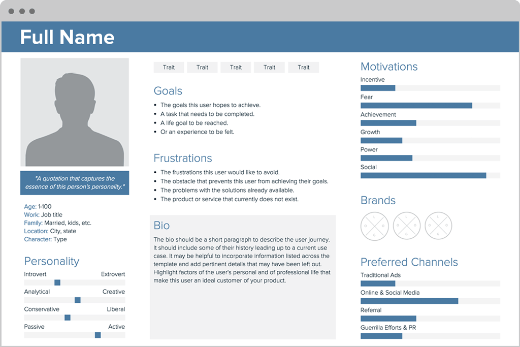
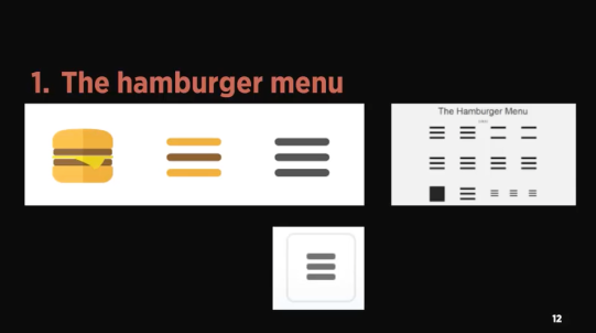
 Image retrieved from
 Digital Interaction